Poverty Tracker
Interative Data Design
Interative Data Design
Fathom worked with the Robin Hood Foundation over the course of several years to build out a series of reports on poverty in New York City into something interactive and accessible to the public. I was the lead designer for a system of graphics to explore poverty’s longitudinal effects, allowing users to see track how individuals move in and out of poverty, as well as what demographics are most vulnerable.
I designed this project documentation video to show the different methods we used to visualize the data on poverty in NYC across three years.
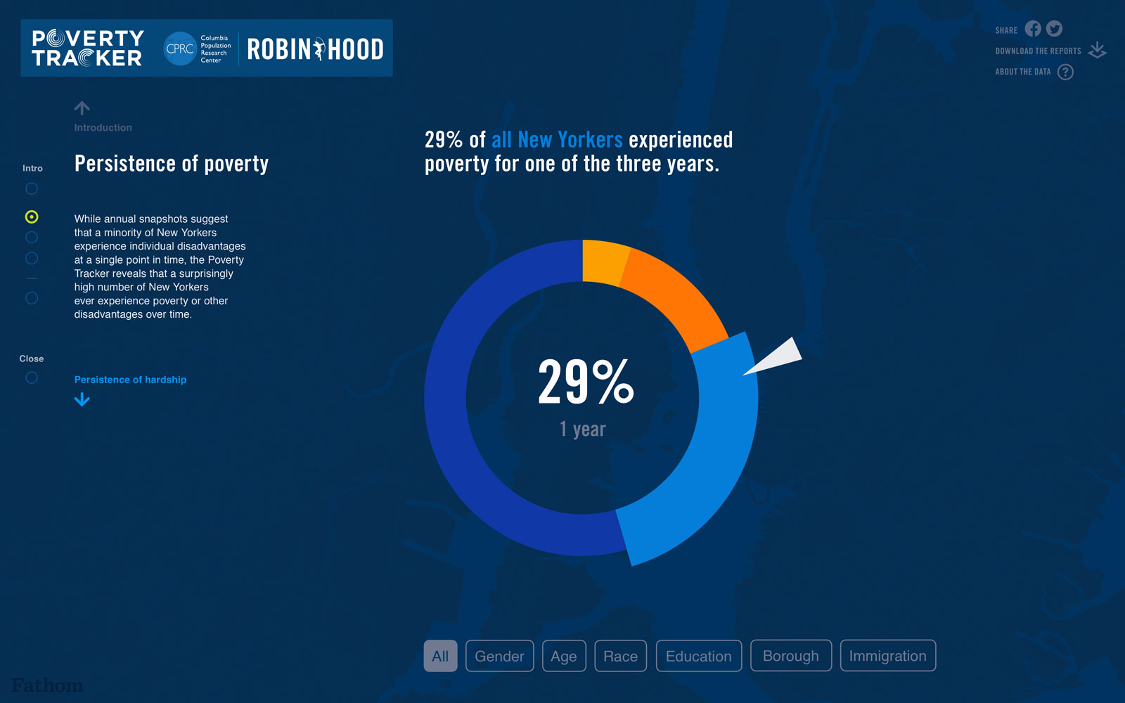
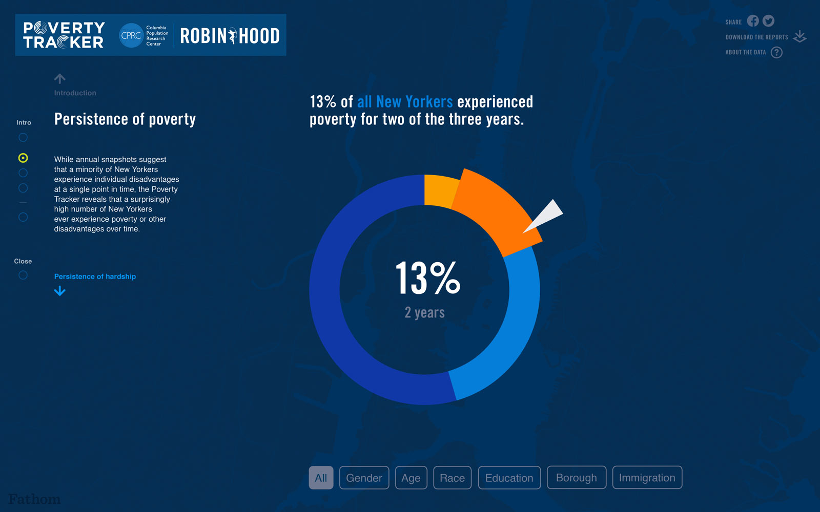
I developed this interactive design to show the breakdown of how poverty persisted among different demographics across the three-year study.
