Oscar Data
Personal Work
Personal Work
I’ve always been fascinated by the range in budgets among oscar nominees, and started a series of data visualizations comparing different aspects of the nominated films.

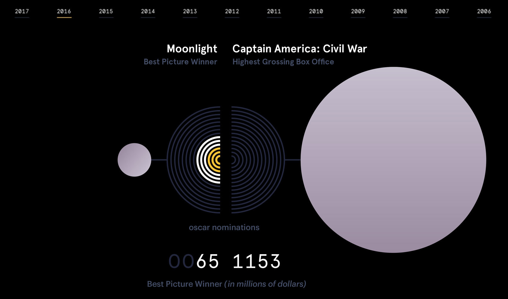
I built an interactive sketch comparing details of the Best Picture winner against that year’s highest grossing film. The Return of the King is the only instance in the past two decades where the top-grossing film of the year also won Best Picture; much more often the comparisons look something like this: many accolades and modest returns for the Best Picture Winner (in this case, Moonlight) while a massive box office hit gathers far less critical acclaim.
For several years running, I charted the films’ respective budgets (represented by the central blue circle) orbited by a ring of Academy Award nominations and wins.